
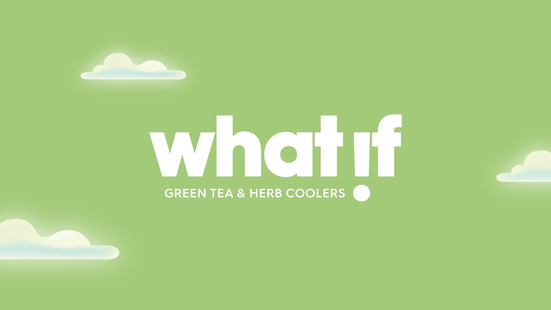
a herb drink with clear benefits
work done at Itu Chaudhuri Design / role art direction / client Sipwise Beverages
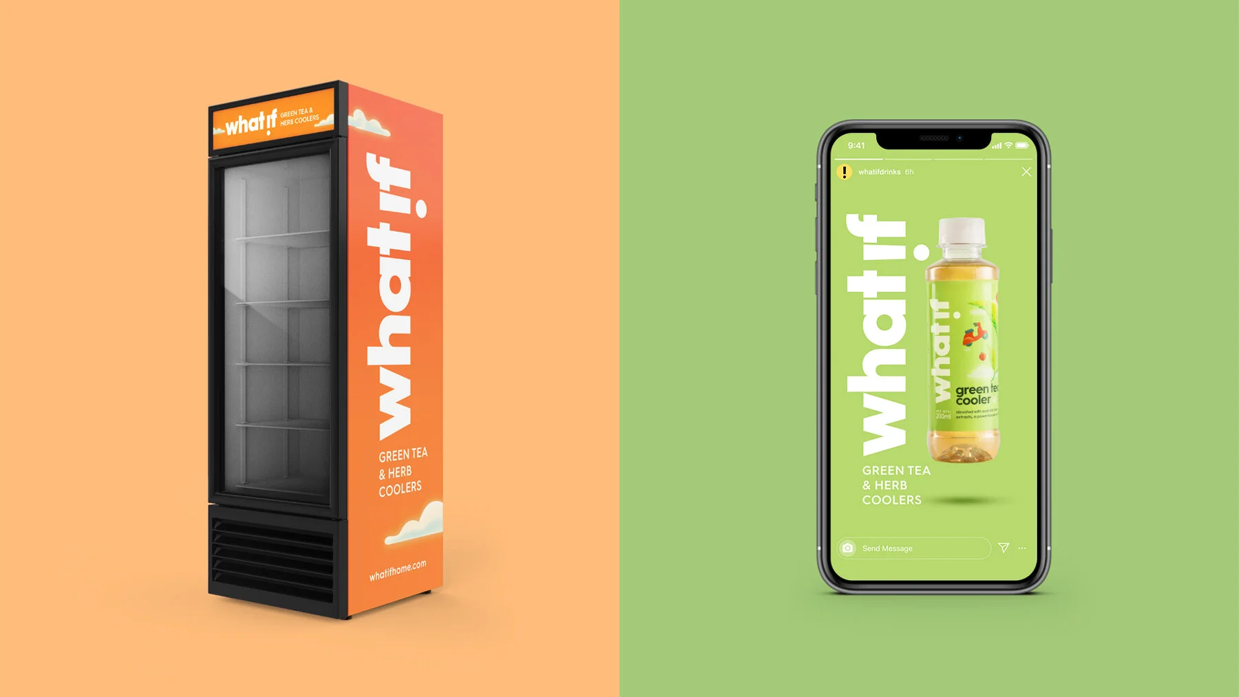
In 2015, Sipwise entered the growing health drinks market with What If, a functional beverage made with natural ingredients like green tea and herb extracts. An underwhelming response from consumers revealed that the packaging was not conveying its nutritive properties. We were approached to redesign the identity and packaging to improve its presence on the shelf.
We found that the pack failed to justify the quirky brand name for a drink with many beneficial properties like hydration, reducing stress, and restoring pH balance confer benefits of clarity, calmness and a freer state of mind. Conveying the functional features and establishing a connection with their benefits would give meaning to What If and justify its overarching proposition of ‘possibilities’.

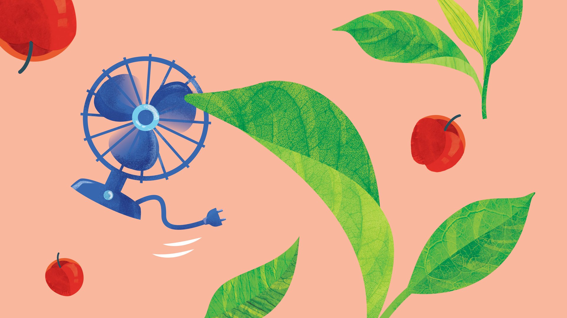
a state of mind and body: floating above everyday stress
The light-hearted picturing of weightlessness, takes the weight off the expected rational conversation on ingredient benefits. It hints that the experience of drinking What If is as important to the state of mind as antioxidants or vitamins. The copy identifies the herbs as ‘elevating’ and explains the key benefits on a dedicated panel of the pack.


revealing the goodness inside
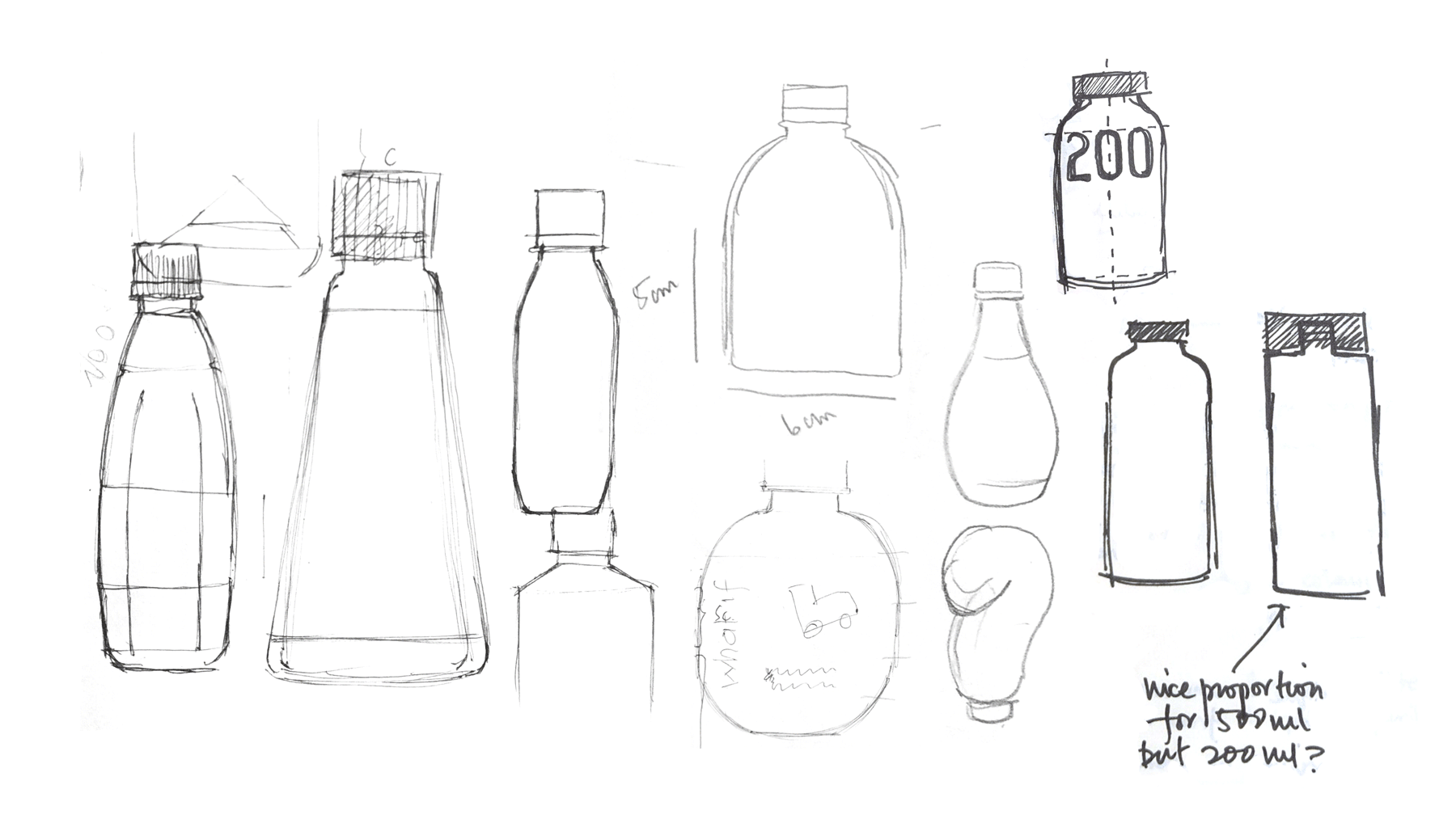
The label reveals the naturally-coloured liquid inside while maintaining enough real estate to communicate its benefits, personality and mandatories on smaller packs. Bottle structures with fewer grooves and simple shapes were explored to differentiate and premiumize the offering, given its price.


partner in charge Itu Chaudhuri / creative director Itu Chaudhuri / art director Richa Bhargava / design concept Sonal Singh / design development Richa Bhargava, Sonal Singh / production supervision Sonal Singh / animation Sonal Singh