
order and clarity for India’s leading financial newspaper
work done at Itu Chaudhuri Design / role design concept & development / client Bennett Coleman
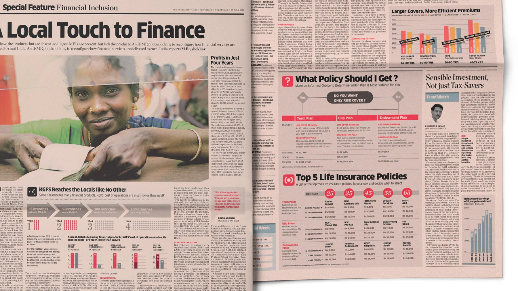
The Economic Times has been the financial daily with the highest readership in India for many years. Over time, the desire to widen its audience steered the content to include a mix of non-business content such as politics, technology and art as well. More recently, it was felt that younger readers transitioning into the readership pool tended to opt for their competitors, challenging their status as the leader. Ad hoc changes made to attract these readers and enliven the offering only resulted in a cacophony of styles and mismatched furniture.
We found that rather than appearing younger, projecting its authority as the leader would be a bigger draw for its aspirational readers. A contemporary, well-organised, highly readable design would serve old faithfuls and new readers alike.


a typographic style for variety and liveliness
Typefaces were chosen to create a duality of seriousness and informality, with an uncompromising strife for economy. In support, interruptive gestures—introductions and articles punctured by snippets and subheads—supported selective reading.


a graphics style that eliminates clutter
A controlled colour palette was introduced to unify pages leaving room to modulate tonality and urgency. A consolidated library of icons was introduced to enliven headlines and punctuate graphical data. New sections were given mini-identities and the slugs were turned into a clear family. The Infographics style aimed to reveal rather than leave the reader to decipher a dump of data. Obscure tables were replaced by data graphics that expose patterns, wherever possible.


partner in charge Itu Chaudhuri / creative direction Itu Chaudhuri / design concept Richa Bhargava / design development Richa Bhargava, Varghese Matthew